

Professional photo printing is the final and most crucial step in a photographer’s workflow. Even the most stunning, perfectly composed image can fall flat if printed incorrectly. Whether you’re preparing a gallery exhibition, client delivery, or personal portfolio, avoiding common printing mistakes can make the difference between an amateur output and a professional print.
If becoming a professional photo printer is your goal, you’re in the right place. In this article, we break down the ten most critical mistakes and share effective solutions to help you elevate your print quality. Let’s take a closer look.
Mistake 1: Using Low-Resolution Files
Resolution heavily influences print detail and clarity.
Using low-resolution image files often leads to poor print quality. Images that look sharp on screens may appear pixelated, blurry, or jagged in print, especially in large formats, usually due to using web images, over-enlarging files, or ignoring final print dimensions. Once resolution is inadequate, lost detail cannot be restored through printing or ink improvements.
The Fix:
Prepare artwork using professional tools like Adobe Photoshop, or other alternatives like GIMP, Affinity Photo & Luminar Neo, and set the resolution to 300 DPI or 600 DPI based on print requirements.
Mistake 2: Poor File Preparation & Editing Workflow
A print-ready file requires different adjustments than a screen-ready file.
Poor file preparation is a common and costly printing mistake. Errors like wrong colour modes, low-resolution images, missing bleed, improper scaling, or unflattened layers cause colour inaccuracies, blurred prints, and cropping issues. Inconsistent or rushed workflows increase reprints, waste materials, delay deliveries, and reduce overall print quality
The Fix:
Correct colour mode and resolution, embedding fonts, adding proper bleed, and running preflight checks. For soft-proofing, first calibrate the monitor, then select the correct printer–ink–paper ICC profile in the design software, enable soft proof or proof colours, and make necessary colour adjustments before printing.
Mistake 3: Colour Management in Inkjet Printing
Poor colour management in inkjet printing can turn vibrant, well-edited images into dull, inaccurate prints if not handled correctly.
Incorrect colour management causes colour shifts, dull prints, and mismatches between screen and output, often due to uncalibrated monitors, wrong colour modes, ignored ICC profiles, or using the same file across desktop and large-format (LFP) printers without printer-specific settings.
The Fix:
Poor colour management causes colour shifts and screen-to-print mismatches. Calibrate the monitor, use the correct colour space and ICC profile. On Epson SureColor P700 and Canon PRO-300, let the application manage colour; on Epson SureColor P9570 and Canon PRO-4100, use RIP or recommended settings with soft-proofing.
Mistake 4: Poor Paper Selection
Using the wrong paper can severely affect colour, sharpness, and print quality, as different papers react differently to ink. Assuming one paper suits all jobs often results in muted colours, banding, or poor absorption. Testing the same print on two different papers helps identify the best match for the image, ink, and printer.
The Fix:
Choose paper designed for your printer and application, and run small test prints on different types. Match printer settings to the paper profile, including media type and ink limits. Testing and profiling ensure consistent, vibrant, professional-quality prints.
Mistake 5: Not Calibrating Your Inkjet Printer
Not calibrating your inkjet printer causes inconsistent colours, incorrect brightness, and screen-to-print mismatches. Even with good files and paper, ink variations, media changes, and environmental factors can create colour shifts. This results in repeated test prints, wasted ink and paper, and unpredictable output in both desktop and large-format printing.
The Fix:
Calibrate your inkjet printer regularly using built-in tools or a spectrophotometer, and use the correct ICC profiles for each printer–ink–paper combination. Pair printer calibration with a calibrated monitor and soft-proofing for accurate previews. Perform routine maintenance, such as printheads cleaning and recalibrating, whenever inks, media, or printers change to ensure consistent, professional-quality output.
Mistake 6: Ignoring ICC Profiles
ICC profiles ensure that your printer, paper, and ink combination reproduces colours accurately.
ICC profiles are essential for accurate printing, as they translate image colours to match the printer’s capabilities. Without proper profiles, prints can appear dull, oversaturated, or colour-shifted. By aligning the printer, ink, and paper or fabric, ICC profiles ensure consistent and predictable results. Relying on default settings often causes reprints, wasted materials, and dissatisfied clients.
The Fix :
Always use ICC profiles specific to your printer and media. Apply them during file export and in the printer or RIP software to avoid double colour management. Conduct test prints to verify accuracy before full production for consistent, reliable results.
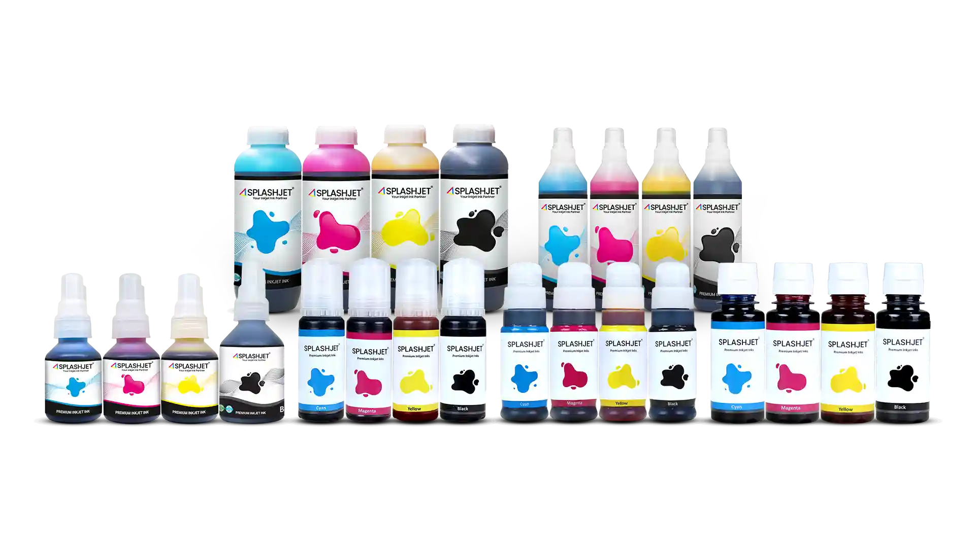
Mistake 7: Choosing the Wrong Third-Party Inks
Choosing third-party ink based only on price can damage print quality and printer health. Poorly formulated inks may cause colour inconsistency, nozzle clogging, and reduced printhead life. They often lack proper calibration, use low-quality colourants, or have incorrect formulations. Although problems may not appear immediately, they lead to unstable output, frequent maintenance, and higher long-term costs.
The Fix:
When choosing third-party ink, ensure it is tested for your printer and printhead, supported by accurate ICC profiles, and offers consistent colour stability. Check for proper ink formulation, fade and water resistance, and reliable technical support. A well-engineered third-party ink protects your printer while delivering professional-quality, cost-effective results.
For more information, read – Print Professional Photos at Home
CONCLUSION
Professional photo printing is both an art and a technical process. By avoiding these common mistakes, you can ensure that every print reflects your creative vision, rich in colour, full of detail, and visually compelling. Adopting a careful, consistent workflow helps you produce gallery-worthy prints every time.